Last month, you may remember we did a post with some tips about how to optimise your charity website so you have the best chance of attracting new donors and generating maximum revenue through this method. Just to recap on the first five tips: Easy to donate; Mission front and centre; Beneficiaries are your hero; Use pictures, not words; and, Designed for your visitors. You can read the blog post in full here.
In today’s post, we will be looking at another four tips to help achieve great website success.
Update regularly
To ensure supporters are encouraged back to your website again and again, it’s important to have updated content. You can do this easily through a news section on your site and posting an article at least once a fortnight. You can also regularly update an events section. The more updated your content is, the higher your ranking in search engines, also.
Blogs are another great way to have fresh content on your website. Having a blog written by your CEO, Chair or Program workers, or even a combination of this, allows your supporters to gain insights about your organisation from varied sources. The best things about blogs are that they can have an authenticity that your more-formal communications cannot always have. One Girl’s blog is one of the best examples of this – so raw and open – it really draws its readers in and makes them feel closer to the organisation.

Mobile-friendly
Studies suggest that about half of all visits to charity websites (and I’d assume websites in general) are via a mobile device so making your site mobile-enabled is a must. A lot of charities do this now, and if you’re site is on a platform like WordPress, it has probably happened automatically.
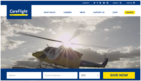
 Make sure, however, that one the home page and donate page of your mobile version site the main messages and functionality is there. Charity: Water is one organisation that does this brilliantly. On their home page they get straight into making a donation and if you swipe down a little you get to the heart of what they do; their mission.
Make sure it can be found
SEO is a very important acronym in the world wide web and if you don’t know what it is or what it means, chances are your website will not be easily found on your site. SEO stands for ‘Search Engine Optimisation’ and it’s all about helping your website rank higher in an online search. The higher your ranking, the easier it is for prospective supporters to find your charity. While historically key words were important, nowadays it’s more about having longer, more updated content and being mobile-enabled (two points we just covered above). If you’re not too sure about SEO, it’s definitely worth investing in an external provider to make sure your organisation’s site is being found.
Google, one of the world’s biggest internet search engines, offers a service called Google AdWords which is basically an online advertising service. Google, being the socially-conscious and ethically-minded business that it is, has an arm that helps charities get the best results online. Google for Non-Profits provides eligible charities with up to $10,000 of free Google AdWords each month. This article on ProBono’s website shares some great info about how to do that.
Be Social
 We can’t really talk about websites and not mention social media. Most people will tell you that one of the main objectives of your social media platforms is to send traffic to your website, so I think it’s important to be aware of this while creating your site. Each time you update content on your site (which as per the tip above, this should be quite often) you can share this new content on your social media accounts. Don’t be afraid to re-share content as well, especially if there is some new point of relevance you can draw from it. Remember, you will probably get sick of your content long before your supporters day as they are not as close to it as you are!
As Jeff Stanger says in Achieving Excellence in Fundraising, “the secret to being successful online is to master the tried and true principles of fundraising and then apply them to the online environment.” I would certainly agree with this and think it’s important that charities do not to forget this. Hopefully some of the tips in this two-part blog post will help.
If you have any other vital tips for others please feel free to share in the comments below. Otherwise, all the best with your making your website more wonderful and attracting new donors.
See you in the pond,
The Fish Chick.